Usage
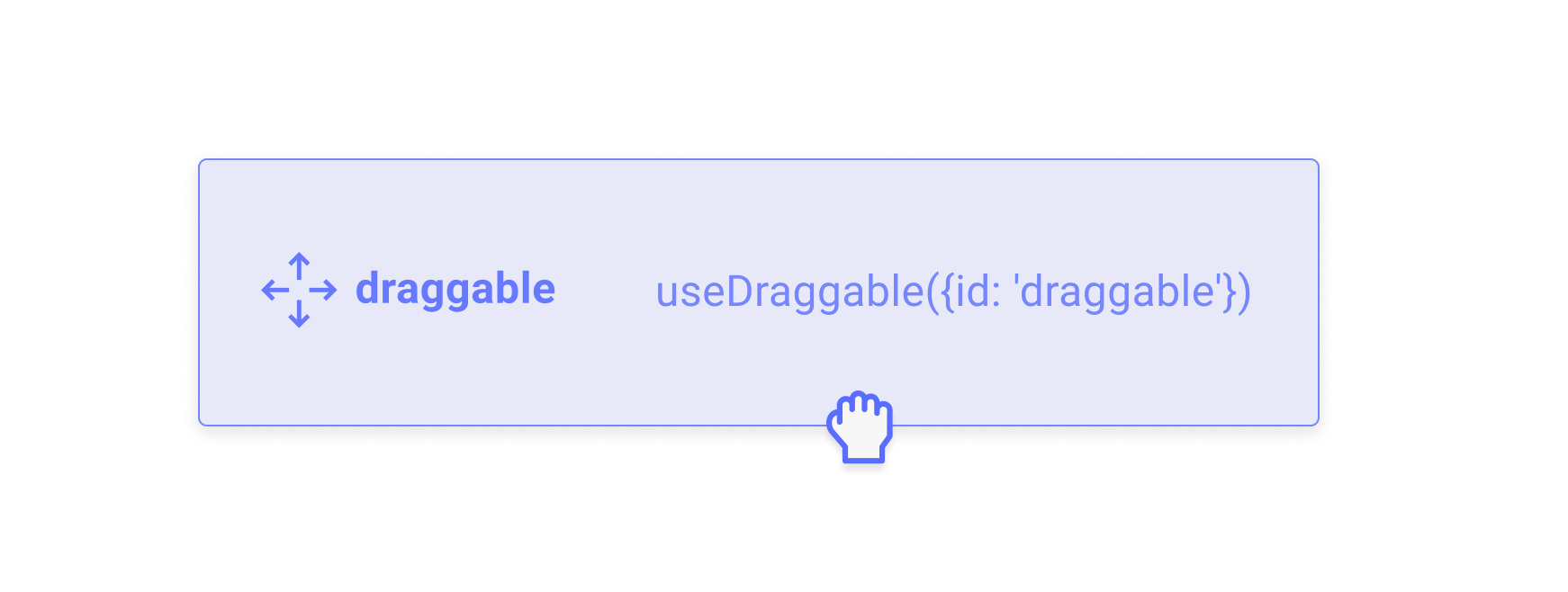
TheuseDraggable hook isn’t particularly opinionated about how your app should be structured.
Node ref
At minimum though, you need to pass thesetNodeRef function that is returned by the useDraggable hook to a DOM element so that it can access the underlying DOM node and keep track of it to detect collisions and intersections with other droppable elements.
Always try to use the DOM element that is most semantic in the context of your app.
Check out our Accessibility guide to learn more about how you can help provide a better experience for screen readers.
Check out our Accessibility guide to learn more about how you can help provide a better experience for screen readers.
Identifier
Theid argument is a string that should be a unique identifier, meaning there should be no other draggable elements that share that same identifier within a given DndContext provider.
Listeners
TheuseDraggable hook requires that you attach listeners to the DOM node that you would like to become the activator to start dragging.
While we could have attached these listeners manually to the node provided to setNodeRef, there are actually a number of key advantages to forcing the consumer to manually attach the listeners.
Flexibility
While many drag and drop libraries need to expose the concept of “drag handles”, creating a drag handle with theuseDraggable hook is as simple as manually attaching the listeners to a different DOM element than the one that is set as the draggable source DOM node:
When attaching the listeners to a different element than the node that is draggable, make sure you also attach the attributes to the same node that has the listeners attached so that it is still accessible.
Performance
This strategy also means that we’re able to use React synthetic events, which ultimately leads to improved performance over manually attaching event listeners to each individual node.Why? Because rather than having to attach individual event listeners for each draggable DOM node, React attaches a single event listener for every type of event we listen to on the
document. Once click on one of the draggable nodes happens, React’s listener on the document dispatches a SyntheticEvent back to the original handler.
Transforms
In order to actually see your draggable items move on screen, you’ll need to move the item using CSS. You can use inline styles, CSS variables, or even CSS-in-JS libraries to pass thetransform property as CSS to your draggable element.
After an item starts being dragged, the transform property will be populated with the translate coordinates you’ll need to move the item on the screen. The transform object adheres to the following shape: {x: number, y: number, scaleX: number, scaleY: number}
The x and y coordinates represent the delta from the point of origin of your draggable element since it started being dragged.
The scaleX and scaleY properties represent the difference in scale between the item that is dragged and the droppable container it is currently over. This is useful for building interfaces where the draggable item needs to adapt to the size of the droppable container it is currently over.
The CSS helper is entirely optional; it’s a convenient helper for generating CSS transform strings, and is equivalent to manually constructing the string as such:
Attributes
TheuseDraggable hook **** provides a set of sensible default attributes for draggable items. We recommend you attach these to the HTML element you are attaching the draggable listeners to.
We encourage you to manually attach the attributes that you think make sense in the context of your application rather than using them all without considering whether it makes sense to do so.
For example, if the HTML element you are attaching the useDraggable listeners to is already a semantic button, although it’s harmless to do so, there’s no need to add the role="button" attribute, since that is already the default role.
| Attribute | Default value | Description |
|---|---|---|
role | "button" | If possible, we recommend you use a semantic In case that’s not possible, make sure you include the |
tabIndex | "0" | In order for your draggable elements to receive keyboard focus, they need to have the tabindex attribute set to 0 if they are not natively interactive elements (such as the HTML button element). For this reason, the useDraggable hook sets the tabindex="0" attribute by default. |
aria-roledescription | "draggable" | While draggable is a sensible default, we recommend you customize this value to something that is tailored to the use case you are building. |
aria-describedby | "DndContext-[uniqueId]" | Each draggable item is provided a unique aria-describedby ID that points to the screen reader instructions to be read out when a draggable item receives focus. |
Accessibility
Recommendations
touch-action
We highly recommend you specify the touch-action CSS property for all of your draggable elements.
TheIn general, we recommend you set thetouch-actionCSS property sets how an element’s region can be manipulated by a touchscreen user (for example, by zooming features built into the browser).
Source: MDN
touch-action property to none for draggable elements in order to prevent scrolling on mobile devices.
For Pointer Events, there is no way to prevent the default behaviour of the browser on touch devices when interacting with a draggable element from the pointer event listeners. Using
touch-action: none; is the only way to reliably prevent scrolling for pointer events.Further, using touch-action: none; is currently the only reliable way to prevent scrolling in iOS Safari for both Touch and Pointer events.touch-action to none only for the drag handle, so that the contents of the list can still be scrolled, but that initiating a drag from the drag handle does not scroll the page.
Once a pointerdown or touchstart event has been initiated, any changes to the touch-action value will be ignored. Programmatically changing the touch-action value for an element from auto to none after a pointer or touch event has been initiated will not result in the user agent aborting or suppressing any default behavior for that event for as long as that pointer is active (for more details, refer to the Pointer Events Level 2 Spec).
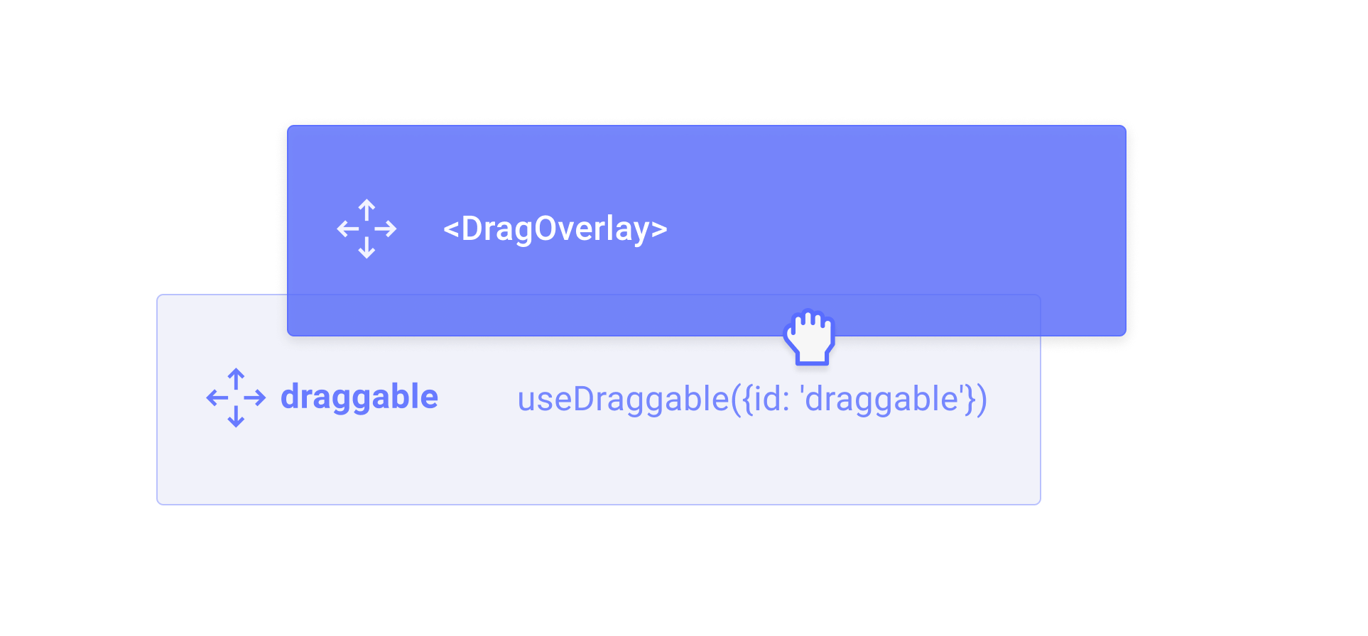
Drag Overlay
The<DragOverlay> component provides a way to render a draggable overlay that is removed from the normal document flow and is positioned relative to the viewport.
 To learn more about how to use drag overlays, read the in-depth guide:
Drag overlay